 By Charlotte Blissett-Griffiths, Ivory Egg (UK) Ltd.
Great lighting can significantly add to the enjoyment of a home, and is much easier to control with the right user interface design. In order to help the user to achieve the perfect ambience in their home, they need to be able to easily control and operate the lighting, otherwise the positive benefits of an otherwise good lighting scheme may be lost. Users want to come home and set the right room mood and ambience without the frustration of pressing lots of different buttons.

So, how to make it easy? Here are some top tips to keep lighting simple for the user.
Labels
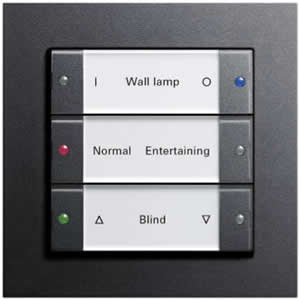
A sensibly-labelled controller is one way of keeping it simple, with each button dedicated to a different scene setting.

Customers can have a selection of different scenes to suit their needs and it is important that they are labelled appropriately. Typically, these fall into two camps, based on either intensity or activity. Intensity-based labelling may in fact have particular activities in mind, but in order to minimise the complexity and number of buttons required, use labels such as High, Medium and Low. These might apply to activities such as eating, entertaining, reading or watching TV for example.
Care should be taken with activity names. For example, if a switch is labelled ‘TV’ and a guest comes over and presses the switch, they may make the assumption that this switch will turn the TV on, when in fact it only selects the desired lighting scene for watching TV.
The best switch manufacturers will provide professionally-printed labels and even etched labelling in order to make sure that the switch still looks great.
Alternatives to Labels
There is a school of thought however, that no matter how well done, labelling can detract from the aesthetic appearance of a switch. To accommodate this view, there are other ways of remembering what each button does. Colour for example, is particularly effective, as it is easy to commit to memory, but only if the colours are consistent across a home, including the colours chosen for other switches and also apps.

Levels of Interaction
It is also important to consider different levels of interaction. For example a visiting guest should be able to control the lights easily, without being left in the dark! They do not need to know all of the possible lighting scenes, but they will need to find something resembling a switch near to a doorway to call up a ‘main on/off ‘ scene.
Residents on the other hand, will want access to other key scenes, and usually at least one user will want to know how to adjust the stored scenes. It is important that these three main levels of interaction are considered from the start of a project, as they can cause additional complexity later on.
A great control solution should provide different levels of interaction, from simple through to complex. Since most users will initially try and press the top left button of a switch upon approach, it makes sense that this button should activate the main on/off scene for the room.

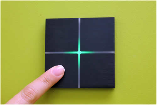
Some switches also provide multi-touch capability, which can also be linked to this main on/off scene. Additional button combinations, or push and hold functionality, can also be used for different scene options. The ability to select a main scene, then easily dim lights up and down, should also be considered, although it is not always easy to achieve all of this with just one switch.
Multiple Switches
For everyday use, simply using a larger on/off switch is a quick and convenient way of activating the most common on/off scene. We can then add a multifunctional switch, located below the main switch, for further and more complex scene setting or adjustment.
Feedback
Many lighting scenes feel best when they dim up and down slowly. This delay often leads to problems as the user can be uncertain that they have operated the switch correctly. A switch that provides feedback, either through a status LED that responds quickly, a mechanical click or haptic feedback through the finger, will place the user at ease and reassure them that the switch has registered their command. This could be potentially vital for elderly or disabled users who may need different kinds of reassurance that their system is functioning properly.

Follow Up
It is also advisable to allow for changes in labelling, light scenes and circuit configurations after the customer has moved into their home. Typically, a visit 2-3 months after the customer has been using the system will often provide a lot of scope for simplifying control and increasing enjoyment.
Conclusion
When designing lighting control, systems integrators should take into account that each user will have different lighting and light switch experiences. It is never easy making an inherently complex system appear simple and intuitive, but that is the challenge that KNX professionals face every day. It is possible, and there are numerous products available that make it easier. It is also one of the most important tasks for us all, since it is the ability of our industry to make inherently complicated automation systems easy to use and joyous additions to beautiful homes, that drives customers to us.
Charlotte Blissett-Griffiths is the Marketing Coordinator for Ivory Egg (UK) Ltd, a supplier of leading KNX products and provider of KNX training courses. Ivory Egg runs a number of training courses on how to achieve heating/cooling control with KNX.


